Showing posts with label 2016. Show all posts

Saturday, November 26, 2016

Collecting Football Cards Again,Thanks to Dallas!

I hadn't been watching much football,up until a couple of weeks ago when I got my first glance at the new look Dallas Cowboys.Dak Prescott and Ezekial Elliott are beasts!I've gotten the warm fuzzies the last two games I've watched them play .I haven't gotten those warm fuzzies since Emmitt and Aikman.Dak and Ezekial have me watching again.Yeah my Bills have been semi-entertaining this year and things are looking up with Watkins and McCoy coming back this Sunday.But man,when was the last time you saw two rookies jettison a team into first place the way Prescott and Elliott have.It's pretty damn impressive.Impressive enough to make me want to buy football cards again!I really want those Elliott and Prescott Rated Rookie cards  and last night was my first attempt at It.I picked up three value packs but failed to pull any Elliot's or Prescott's.The hunt  begins!


Remember when I poked fun at this card design?Saying how we should be glad that Topps card designs weren't nearly as bad as 1990 Donruss baseball?


Seems like Donruss got offended and released a similar design for their 2016 NFL product,only this time with a little flair!


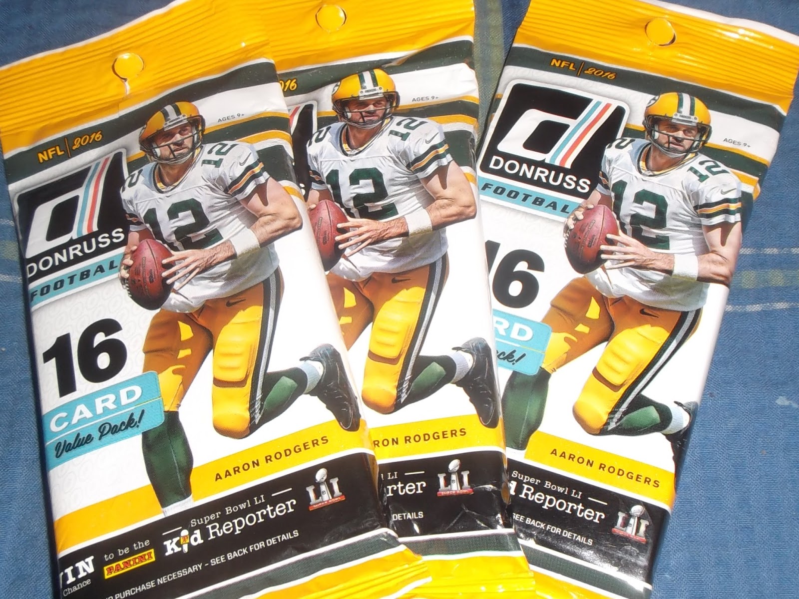
The base cards are much like that of  90's Donruss design with the confetti like specks ,only now they pretty much surround the entire card.The card borders reflect the team colors and the foil used for the players position and team affiliation really make the cards pop.Like most cards today,they have that glossy finish and also smell great out of the wrapper :)


Base rc's look the same only with the rc logo. 


I'm not sure what's so different about the Press Proof cards besides the fact that they scream Press Proof across the bottom of the card.I don't see any serial numbers or  print run on them.


These are my favorite. Donruss decided to go with the 87 styled borders  for their Rated Rookie's only this time you get footballs instead of baseballs on the left and right hand sides of the card. Also,It seems all RR's in this set have  the same ,silver/gray border.I think they look pretty awesome.


Again,these are identical to the RR's above only with Press Proof written across the bottom.


I'm not big on baseball card inserts that feature anything but a baseball player on them,but I can get behind this.This Is football so I'm not gonna get a card of some scrawny 90 year old lady throwing out a first pitch.The borders are gold foil .   


I always like the way Panini sneaks veteran stars and hall of flamers onto their base card design.It seems like 1992 again when you pull a Barry Sanders card that doesn't give any telltale signs of It being a commemorative card.  


Yeah,I'll continue to pick up 16 Donruss  on the strength of the Elliott and Prescott rookie cards .But something tells me I'll be more than happy with the collateral damage . 


Friday, March 18, 2016

Singles Only


Here are my latest pick ups.A couple of Conforto's and a Jacob DeGrom,all from the 2016 Donruss release.I don't mind the Donruss Panini product.In fact I like It.Their inserts are fun ,baseball player related and won't feature Bud Seligs pet hamster  or some old lady throwing  a 2 mile per hour first pitch a la Topps flagship.It's heart warming and all but I think there's a place for cards like that,and that place Isn't In my  collection.I'll be going over some more Panini Donruss 2016  once I get the must haves from the set ( mostly Mets and some pc guys)out of the way. 

I'm glad Panini decided to stay with the same Rated Rookie logo and not try and switch up the font on It.Same for The Rookies logo.I love that old school touch on cards of new school players! I'm still not 100% sold on Conforto but I know the kid's got talent.I can't wait to see the kind of numbers he puts up given a whole year to show what he can do.He kind of gives off the same vibes Jefferies did when he first came into the league and onto the Mets In '88 -' 89. 


These homage to '82 Donruss inserts aren't horrible but could have been perfect had they shrunken the Donruss logo and '16 on the right hand corner.I love this card mostly because It shows DeGrom batting. A combined 23 -14 over his first two Major League seasons ,DeGrom looks to improve on that In 2016.


Monday, February 22, 2016

Dun,Dun,Dun,Dun!


I would have titled this  "Another 2016 Topps Post" but I  didn't want to scare away any potential readers.2016 Topps Baseball  has been treated like a zebra carcass  being ravaged by a pack of  wild hyena.Dragged through the dirt and left for dead In the hot sun for the buzzards to pick at.It seems like everybody can't wait to publish their rant posts, just to vent some of that collector's frustration.Lets go over some of the main gripes and then I'll counter with why I don't see a problem with them...


BTW- In no way am I trying to discredit anyone's views on this years product as everybody Is entitled to their own opinion ;)


Gripe # 1-  Artsy ,fartsy ,white corner  design comparable to a high school graphic art design project


My Rebuttal - That's one pretty damn good high school graphic art design.And when was the last time Topps ever tried anything like this?I haven't seen anything from Topps flagship that looks remotely close to this design and that,to me, Is a good thing.I want different every year,not an improvised version of  the year before.


 Gripe # 2  - Blurred out crowds/backgrounds
               

My Rebuttal - Unless It's a crowd doing something like this,wielding legible signs and looking animated on an otherwise inanimate baseball card ...


...then i'm fine with blurring out a crowd.No problem at all with It.1984 Topps blurred out most of their crowds and backgrounds and still had a kick ass product.Not that 2016 Is a kick ass product ,but the lack of a clear and focused background Isn't a deal breaker for me.


Gripe # 3  - No borders

My Rebuttal - Not that It's as prevalent these days ,but no borders means no off centered cards.


Gripe # 4 - Desecrated  team logos


My Rebuttal - This might be the only thing that kind of bugs me,but come on,we all know  this Is Big Sal and that It's a KC Royals logo.I like the TV style presentation with the protruding name tag.The textured appearance behind the team logo almost looks like a  game used relic/jersey.I like It.


So ,there you have It.I don't dislike 2016 Topps baseball cards.In fact I like  It!Remember,I collected cards In the late 80's ,early 90's.I know what an ugly,bad baseball card looks like.

Exhibit A -

Exhibit B - 

 2016 Topps Is not a bad baseball card.It's not even an ugly design.If there was one thing I would have liked to see switched up a bit ,It's the card backs.Other than that ,I'm happy with this years release.Remember,Topps Isn't a premium product.There are other brands that cover those bases and Topps flagship Isn't one of them.We should all know that by now.But I digress.Here are some more notable pulls from my recent rack pack.


Monday, February 15, 2016

Six Headed Dragon Spotted In Queens , NY!

So I finally scored a Wheeler RC,completing my Mets Topps RC rotation. I'm pretty damn excited about our pitching staff.But at the same ,sick with the butterflies about them.In a perfect world,all 6 of them over achieve and we're looking at an unbeatable rotation.In the real world, I'm hoping for at least two of them to pitch to their full potential and help us reach the post season again.Harvey,Degrom and Syndi are all capable of 15 Win seasons.Matz and Wheeler should be able to win 20 between the two of  them,10 a piece.Another 40 Saves from Jeruys Da Damaja and a dab of Bartolo Cologne puts us right back In the race!