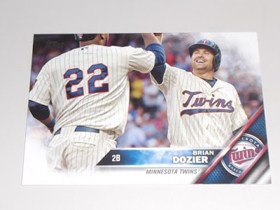
I would have titled this "Another 2016 Topps Post" but I didn't want to scare away any potential readers.2016 Topps Baseball has been treated like a zebra carcass being ravaged by a pack of wild hyena.Dragged through the dirt and left for dead In the hot sun for the buzzards to pick at.It seems like everybody can't wait to publish their rant posts, just to vent some of that collector's frustration.Lets go over some of the main gripes and then I'll counter with why I don't see a problem with them...
BTW- In no way am I trying to discredit anyone's views on this years product as everybody Is entitled to their own opinion ;)
Gripe # 1- Artsy ,fartsy ,white corner design comparable to a high school graphic art design project
My Rebuttal - That's one pretty damn good high school graphic art design.And when was the last time Topps ever tried anything like this?I haven't seen anything from Topps flagship that looks remotely close to this design and that,to me, Is a good thing.I want different every year,not an improvised version of the year before.
Gripe # 2 - Blurred out crowds/backgrounds
My Rebuttal - Unless It's a crowd doing something like this,wielding legible signs and looking animated on an otherwise inanimate baseball card ...
...then i'm fine with blurring out a crowd.No problem at all with It.1984 Topps blurred out most of their crowds and backgrounds and still had a kick ass product.Not that 2016 Is a kick ass product ,but the lack of a clear and focused background Isn't a deal breaker for me.
Gripe # 3 - No borders
My Rebuttal - Not that It's as prevalent these days ,but no borders means no off centered cards.
Gripe # 4 - Desecrated team logos
My Rebuttal - This might be the only thing that kind of bugs me,but come on,we all know this Is Big Sal and that It's a KC Royals logo.I like the TV style presentation with the protruding name tag.The textured appearance behind the team logo almost looks like a game used relic/jersey.I like It.
So ,there you have It.I don't dislike 2016 Topps baseball cards.In fact I like It!Remember,I collected cards In the late 80's ,early 90's.I know what an ugly,bad baseball card looks like.
Exhibit A -
Exhibit B -
2016 Topps Is not a bad baseball card.It's not even an ugly design.If there was one thing I would have liked to see switched up a bit ,It's the card backs.Other than that ,I'm happy with this years release.Remember,Topps Isn't a premium product.There are other brands that cover those bases and Topps flagship Isn't one of them.We should all know that by now.But I digress.Here are some more notable pulls from my recent rack pack.


I have to agree, I don't hate this year' base design. I really loved lasts years colorful borders so following up something like that is going to be hard. Plus the fog gets filled in on the color parallel cards like your featured gold card. My only gripe is the amount of errors that seem to be spread out through this year's cards and inserts. And most of the inserts are meh. It seems the one I like the most Perspectives is either you love it or hate it and I while the 3D lettering doesn't always work most of the card photos are pretty great.
ReplyDeleteLast years design kind of spoiled us,too.But this years design Isn't too far behind as far as originality goes.
DeleteI don't have that much of a problem with the set. I'm not a set collector so I don't get as hung up on the look as most. My focus is always on the checklist. If a Pirate is making his Topps debut I'll go after that. Then if I like the card I will try and focus on some of the more established Pirates.
ReplyDeleteI do agree that the insert sets are really boring. The Perspective insert set is cool and the Pressed in Service is a neat idea, but for the most part they seem subpar.
I was never really a fan of inserts to begin with.There are way too many included in Topps flagship these days.Especially ones that feature non-players.I'm the same way .I don't look to complete sets but I'll go after certain players as well as the obligatory Mets cards.
Delete